MTAlk
Overview:
The Metropolitan Transportation Authority is North America’s largest transportation network, serving a population of 15.3 million people across a 5,000-square-mile travel area surrounding New York City through Long Island, southeastern New York State, and Connecticut. The MTA’s operating agencies are MTA New York City Transit, MTA Bus, Long Island Rail Road, Metro-North Railroad, and MTA Bridges and Tunnels.
Objective:
The aim of this project was to create new software to modernize the MTA's employee communications by creating a secure mobile app that turns cellphones into communication hubs that let them stay connected and do their jobs more efficiently.
Goal: To understand current work communications through research
Process: User interviews, surveys, competitive and comparative analysis.
To understand work-based communication, I created a google survey asking a range of questions my team and I agreed upon such as, employees' most commonly used internal communications, what functioned well and what they would change about them. Our results showed Slack, Zoom, and Teams were the most widely used and that our survey participants wanted more from their work communication apps, including:
Easy to use
More security
Ability to transcribe meetings
Better interface
Better organization
Clear reminders
Easy chat features
Additionally, our research showed employees use multiple devices, so it became essential that our app worked across all devices.
Left: Companies main form of internal communication showing Slack, Zoom and Teams to be industry standards.
Right: Devices primarily used for communicating with co-workers at work, which shows a variety of devices such as laptop, cell, desktop and desk phone.
Competitive Analysis
Based on our above research, each team member picked a business and we put together a list of competitors itemizing their platforms to understand what features each service offered and didn't offer. I did the research for Zoom.
The features that MTAlk offers in comparison to competitors.
The MTA has approximately 74,000 employees. Sylvee, Research lead II and I followed our survey with four interviews with transit workers. I created a draft of interview questions which the team reviewed and edited. During the interview, I asked the questions and Sylvee recorded the interview on Otter.
Interview Breakdown:
Number of Participants: 4
Gender breakdown: 4 males
Age: 33-50
*All participants work in Transportation; three work for an MTA agency.
Goal: To define the user’s needs, goals, motivations and frustrations based on research findings
Process: Persona | HMW Questions | Problem Statement & Solution
Sylvee, Research lead II and I transcribed our user interview findings, and created notes for affinity mapping (seen below). As a team we then organized the notes based on patterns that emerged. This gave all of us insight into how employees used communication devices and what their pain points are.
Based on our interviews we organized our Affinity Map into sections including, security, location, software, work devices, who they internally communicate with and how they internally communicate.
Insights
Privacy is important.
Radio batteries often die on-site, or they are glitchy
Some communication apps work best on a desktop and don't translate to cell phones.
Video communication is confusing underground.
Sometimes hands are tied when working and can't answer the phone, which is a problem because it's mandatory to answer.
Needs
Reliable radio
An app that works across all platforms
Subtitles on videos
Handsfree communication options
Personas
I drafted two personas to ensure we were solving for both employees who work in the office and on-site. Although we only needed one, I felt two personas would help our team create a more functional app for all MTA employees. Our team then edited and refined the personas. Our primary persona, Hank, works off-site, which can be underground in the tunnels. Our secondary persona Remy works primarily in the office.
Primary persona, Hank McCoy: Union Guy “I’m not the most tech savvy person”
Secondary Persona, Remy LeBeau: Corporate Guy “Work life separation is super important to me”
POV Statements & HMW Questions
Next, I re-framed the insights and needs from the user interviews as Point-of-View statements and How-Might-We questions. In doing this, I was able to help our team define the problem and allow us to ideate more solutions for our communications app.
All of the research that was completed lead to the problem statement, which allowed us to begin ideating our app.
“Hank needs a secure way to access different modes of communication easily at work so that he can complete his field tasks efficiently and respond to communications from coworkers in timely manner. “
Goal: To develop concepts for potential solutions based on research insights
Process: Group Brainstorming | User Flows
Group Brainstorming
Each group member iterated what they thought the app might look like. Then, as a group, we reviewed each sketch and together created a vague idea of how the app might look. After the team made a collective decision on the apps MVPs’ we broke them into five userflows to be created by each member. I created the userflow for MYRA (MY Recognition Assistant) a voice recognition software to be used hands free.
My original sketch for what the app might look like which featured a customizable home page.
Original sketch of the MYRA (My Recognition Assistant) flow.
After a few iterations, we settles on this home page sketch which features components from everyone ideas that we voted on.
Goal: To design and integrate the UI of a communications app for MTA employees
Process: Sketches | Branding l Low-fidelity Wireframes
Sketches
MTAlk’s original design was a fixed header and footer navigation with the contact and group divided with a carousel and a dropdown. However, I pushed for making our app ADA compliant by removing content that would have been hidden by the carousels and dropdown. Then Linda and Brenda, the Interaction Leads came up with pinning contacts and groups to the home page.
Lo-Fi Figma wireframes. Left: Home page with MYRA notification. Center: Homepage after MYRA is set up and the user has activated it with a voice command. Right: Our Radio feature.
User flows for our two special features, the radio and the user flow I made, MYRA (MY Recognition Assistant).
Branding
Jonathan our Project Manager created a mood board of MTA apps like MYmta and OMNY as well as maps and photos of city transportation.
Our Project Manager Jonathan also looked up the MTA design guides, and as a team we decided to stay within the universal design they employ, settling on maintaining the palette used in MYmta and the universal font, Helvetica.
MTAlk’s design system showcasing components and imagery created and complied by our Interactions Leads Linda and Brenda.
Goal: To develop a model for MTA’s new app that could be evaluated and improved
Process: High-Fidelity Wireframes | Usability Testing
Highlights:
View contacts and make calls
Send text and photo messages
Use radio feature
Use MYRA voice assistant feature
Save messages to bookmarks
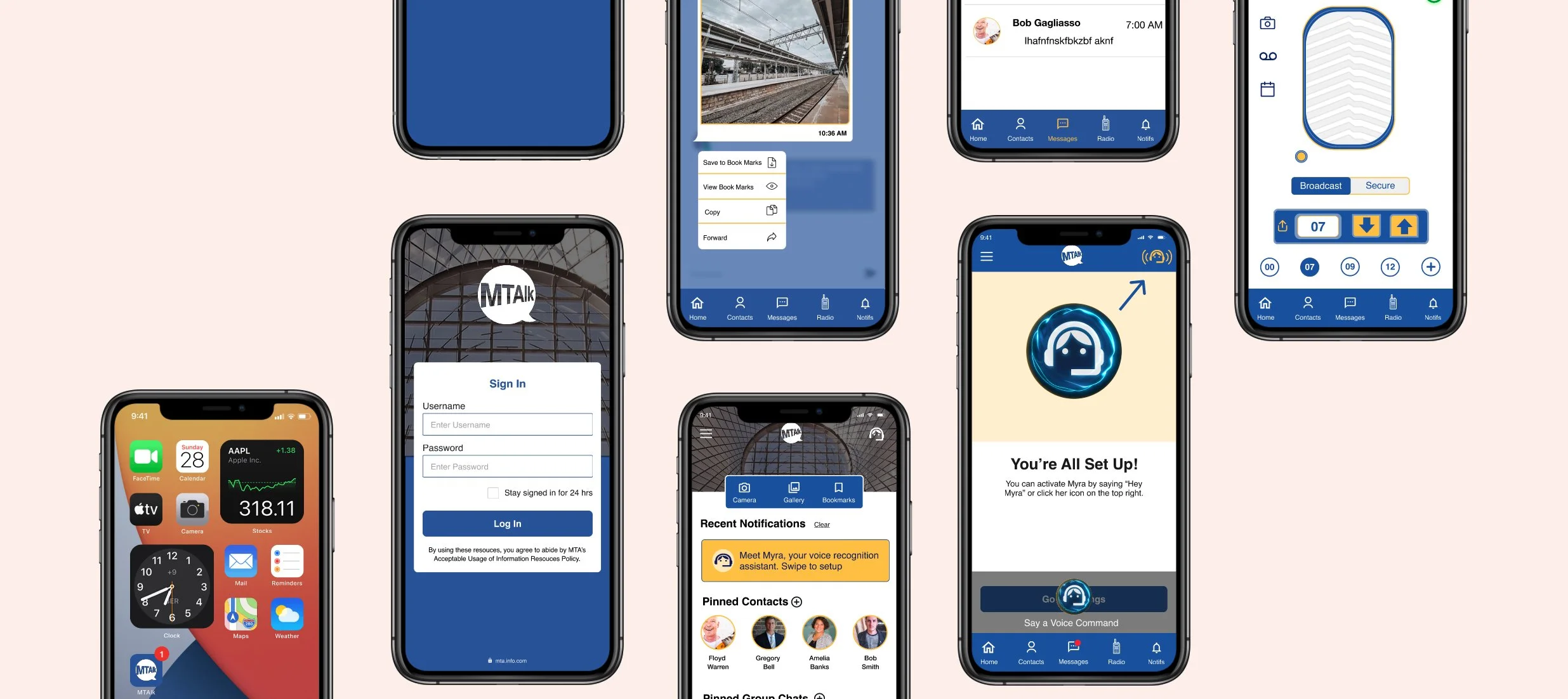
Several hi-fidelity screens from MTAlk our communications app.
Usability testing
We tested our prototype on two of our interviewees with a set of multiple tasks.
Pros:
Users loved the Radio. It was playful and reminded them of "Nextel" which had a radio feature.
Users thought that MTAlk was easy to use and intuituve
Users understood MYRA was like a Siri / Google voice assistant / Microsoft paper clip
Cons:
Users had trouble finding the MYRA icon on the top right. Sometimes it was unclear if "enable Myra" was turning on myra or setting up Myra. On the settings page some users were unsure when given directives to turn Myra off, to use the toggle, or icon on top right corner.
Noticed delay on the home page. One user thought it was an ad, didn't realize it was a button until further notice. Users treated it as a clickable button vs a slide to side.
Users found button to translate unclear or didn't recognize it as a button. Thought it was part of the conversation thread.
Goal: To assess how well the prototype meets users’ needs and goals
Process: Revised Prototype
Based on our the information from our user testing we made the following corrections. We indicated when a message has not been read yet, emphasized the see translation button, so it would be more visible and lastly added on onboarding walk-through for MYRA (MY Recognition Assistant).
Project Takeaways
Testing is key:
A significant revelation from usability testing was MYRA’s on boarding. My findings corrected my assumption about what users would think MYRA is. Before the three-step setup prompt, users didn’t understand MYRA, what it was or how to use it and our research showed that inaccessible features were easily forgotten even if they could be beneficial. Our testing made it evident that the effectiveness of a design or feature is ultimately determined by the people who use it.
Next Steps
More focus on ADA compliance, color, translations and subtitles
Additional MYRA on boarding testing
Do more research on how the employees on the field could use this app without problems.
Build a directory contact page with all contacts from all six agencies.
Build a secure location sharing features.
*This was a General Assembly class project.
