Team
Cary Hulbert - Project Manager & Research Lead II
Ana Cervantes - Research Lead
Nicole McCarthy - Visual Lead
Ashley Baylor - Interaction Lead
Timeline: 5 weeks
Programs: Figma, Otter, Photoshop, Premier & Miro
Challenge:
To build out a marketplace that allows emerging artists to upload their work, have their work listed for sale, accept commissions, and then also be discovered by curators and collectors.
With my background in the visual arts, it made the most sense for me to take a research position and managerial position for this project. As an artist currently featured on other artist's platforms and with peers who, as well as myself, have been selling artwork and navigating the difficulties of meeting curators and selling work, I was able to assist in the beginning process by helping identify competitive businesses as well as use my connections to contact peers for research.
Research
Goal: To understand what artists and collectors want from an online platform to facilitate sales.
Process: User interviews, surveys, competitive and comparative analysis.
We started with a comparative and competitive analysis to help understand what already existed. We selected Artfare, Platform, Saatchi, and Return on Art for our competitive Analysis and Instagram, Etsy, and Society 6 as our comparative analysis. I did the research for Artfare and Platform.
Comparative and competitive analysis
Next, we worked on the survey questions. Based on my experience, I advised the team to create questions that required less typing from the user, such as yes or no questions or check box questions. The data from those types of survey questions lead to quantifiable data, as well as being easier for participant to fill out. I assisted in drafting the questions and reviewing them before the google survey went out. We had 35 participants total.
Survey
The below questions were included in our survey.
Age
Location
Which of the following best describes you?
Have you used any of the following artist's platforms? Check all that apply.
How do you search for art? Check all that apply.
Do you purchase art primarily for yourself or for your job/business?
How do you typically shop for art?
Have you purchased art online?
Would you purchase work from an artist platform?
Would you use the help of AI technology to help cultivate your artistic taste? (find new artists, mediums, and styles that fit your interests?
Our survey made it clear that Alexandria needed to include Instagram, as well as prioritize searching for artwork by color, medium genre, and price. It also indicated that users would like the quiz, as a way to find art that fit a “mood”. Lastly, it shed light on the networking and how much collectors enjoy buying directly from an artist and getting to know them, which lead to ideas about including an “open for studio visits” option.
How do you search for art? Check all that apply.
How do you typically shop for art?
Interviews
We interviewed 5 people ranging from a recent BFA graduate, a recent MFA graduate, an emerging artist, a curator, and an art consultant. I iterated the beginning draft of questions.
There were several insights we gained from these interviews. Below are a few quotes
Artists concerns:
"I'm not good at selling my own work."- Farrah
"Not a fan of questionnaire AI because my work wouldn't fit into that. The meaning would be lost." - Trevor
"I'm turned off by platforms that make an artist pay." -Farrah
Collectors wants:
"I enjoy discovering more about artists and being able to connect with them." - Trinity
"I don't think as a curator, I would feel it was appropriate to buy something sight unseen...you want to make sure that it lives up to how it looks online."- Sam
"Can you tell me what the artist was thinking about ... or what does the work mean? what's the intention?" -Sam
From the interviews, an Affinity Map was made. Each team member took an interview and pulled out critical notes, helping organize the information.
Affinity Maps
Define
Goal: To define the user's needs, goals, motivations, and frustrations based on research findings
Process: Persona | HMW Questions | Problem Statement & Solution
The interviews helped us create our personas. Since the platform is for collectors and artists, we made two personas, one collected and one artist. However, we made the collector our primary persona since the platform's goal is to have art enthusiasts connect with and purchase artists' works.
Primary Persona
Secondary persona
I wrote the drafts for both personas. To help the platform solve some of the concerns we discovered in the interviews, I decided to make our curator have a specific interest in Latinx Art to ensure the AI algorithms would support and help marginalized artists. I created our artist persona Hope, as a sculpture and installation artist, which is more challenging to fit into traditional art categories.
POV Statements & HMW Questions
How might we statements.
All of this information leads to our Problem statement and solution:
Problem statement:
Cecilia needs a way to find new emerging artists, specifically for her interest in Latinx and BIPOC art so that she can broaden her collection and support her community.
Solution:
By providing Cecilia with an online artist platform that utilizes AI to connect collectors and curators with new artists and artwork suggestions, so she can find artists and artworks that appeal to her specific aesthetic.
Ideate
Goal: To develop concepts for potential solutions based on research insights
Process: Group Brainstorming | User Flows
To prioritize, I placed a list of features created from our competitive and comparative research into Miro and made a priority matrix with my group.
Priority Matrix
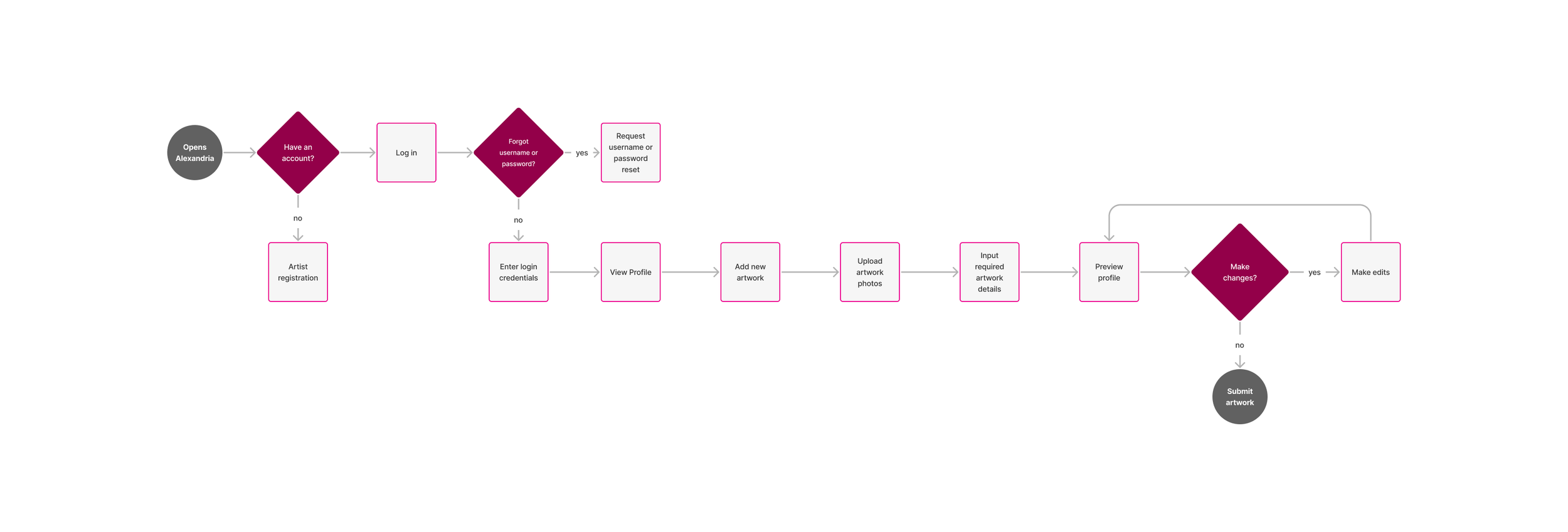
Next, we reviewed what our client wanted us to create, and from there started four flows. Each of us would build a flow out and complete the lo-fi and hi-fi flows. I made the flow for an artist logging in and uploading new work.
My user flow for an artist logging in and uploading new work
After we reviewed and refined each other flows together, we then created what we thought the website would look like individually. Below are my drafts.
Home page
collector onboarding
Artist onbording
Artist page
As a group, we presented our sketches and created a vague idea of what the website might look like to begin our lo-fi frames based on our flows.
We did a combination of Nicole McCarthy's and my sketch for the Artist's page. We went with the organization of my mine and added the sold work section that Nicole McCarthy included in her sketch. Each member of our team took charge of and began creating lo-fi frames.
Design
Goal: To design and integrate the UI of a communications app for MTA employees
Process: Sketches | Branding l Low-fidelity Wireframes
Below are Iterations of my lo-fi frames for the art onboarding and profile page.
When creating the lo-fi frames, our group ran into a disagreement and decided to do A/B testing to figure out how to move forward. Some team members wanted to shorten the search bar into an icon that needed to be clicked to open. I strongly disagreed since the entire premise of the site was to search and to make it as easy as possible; I thought the search bar should be ready to be used and easy to see. The A/B testing proved that users wanted to see the search bar, which we moved forward with.
While we were working on the lo-fi- frames, our Visual Designer Nicole McCarthy, created out visual assets.
Prototype
Goal: To develop a interactive prototype site for Alexandria that could be evaluated and improved
Process: High-Fidelity Wireframes | Usability Testing
Highlights:
Save works you like and create Collections.
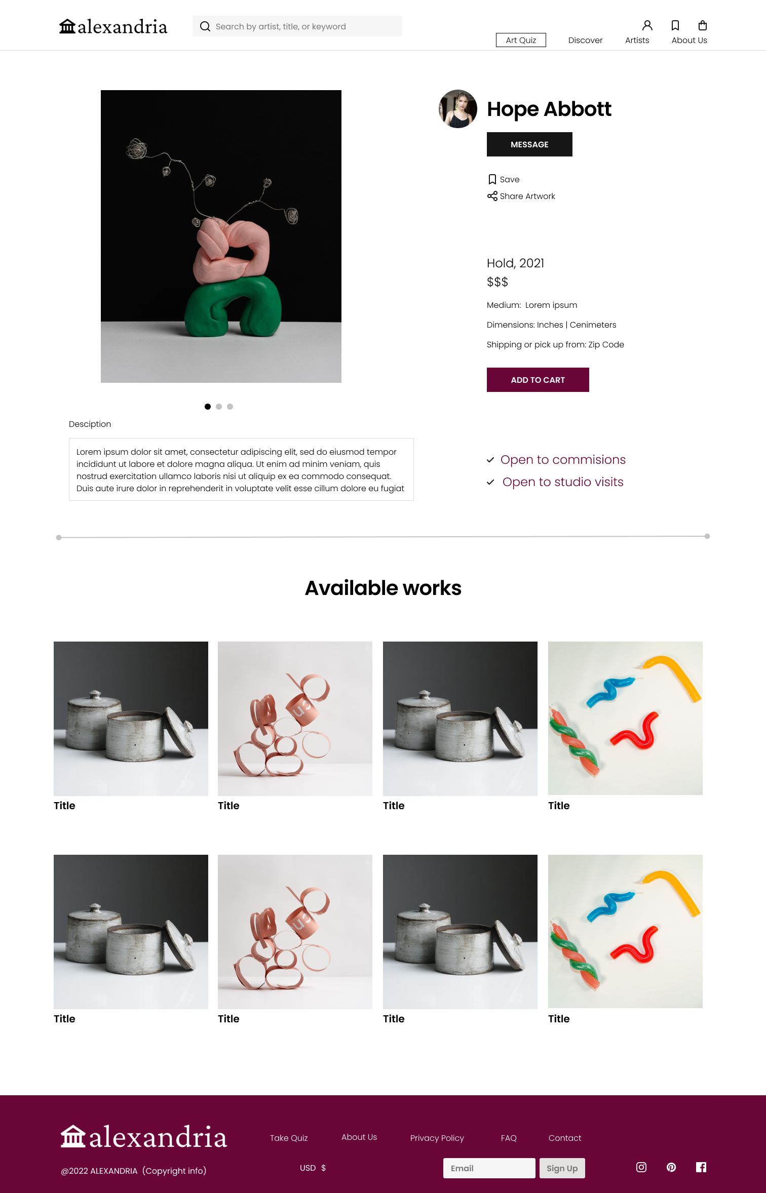
Set up a studio visit to learn more about the artist before purchasing work.
Commission works of art from your favorite artists.
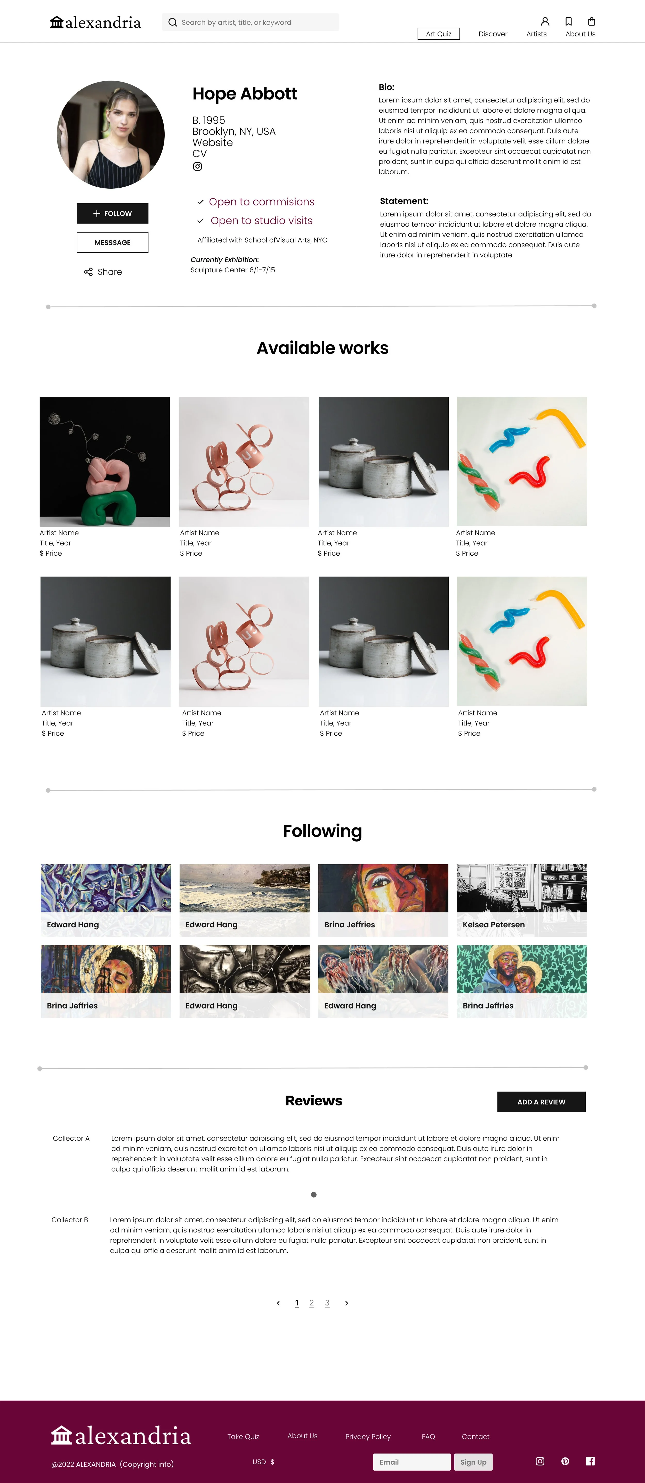
Curators and collectors also have profiles. Artists can follow and learn more about their career and interest.
Get as much info as possible on a profile page: Articles, Affiliations, CV, Bio, Statement and Current Exhibitions, YOB, Location, Website and Instagram.
There were a lot of changes from the lo-fi to hi-fi screens—specifically the back end of how users make profiles and upload images. Initially, we had it all on one page with separate onboarding for artists and curators and then decided to implement simplicity for the user. I decided to break up the onboarding into categories (Profile, Upload Artwork, Saved, Analytics and Security) and combine the curator, collector, and artist onboarding pages.
Usability testing
I lead the tasks and questioning for all usability testing.
Round I of usability testing
Once we had a hi-fidelity prototype based on our research, we began our user testing. We came up with tasks and general questions. For our first round we interviewed Sam, Trinity and Lydia.
We had a few things to think about and revise afterwards. Our landing page seemed off brand, and confusing as to what this platform is. Once logged in, a few buttons were confusing due to language and our double search bar on the discovery page was unnecessary .
We also learned that users want a quick way to browse work without having to log in.
Round II of usability testing
The second round was with Farah and Casey. In general users thought the site was straightforward and there were no longer any missed buttons due to off verbiage.
We did hear a concern about having sold art listed- the artist was concerned it might lead to gate-keeping. That was a decision we made from our user interviews, to help facilitate commissions, however we advised that more testing be done on whether users could find sold works listed as helpful.
Although the site appeared “straightforward” to our users. After the second round we created a sign-up walk through for artists. To help them understand the site does two things. One- there is the onboarding and two- the marketplace.
Iterate
Goal: To assess how well the prototype meets users’ needs and goals
Process: Revised Prototype
Users appreciated a more interactive and on brand landing page to help them understand and engage with the platform.
Changing “Get started” to “Begin Quiz” which is much more straightforward forward.
Removing the confusing second search bar.
Project Takeaways
Testing is key:
Testing is the most critical part of the UX research and design process. It was incredibly valuable in helping create the landing page. Especially when creating a marketplace platform for users with specific aesthetics, it became clear that the site had to navigate effortlessly. It also had to continue its brand strongly throughout and even transcend its marketplace into a place of networking connections - while simultaneously creating sales through that. Testing for this project ultimately started the vibe of the site and the forthcoming of the community that will be present on it.
Next Steps
Accessibility
Maintaining general accessibility principles on the website to ensure inclusion for all people.
Alt text for artworks.
User Centric
Make specific, measurable goal setting part of onboarding.
More testing to ensure that marginalized artists feel that they can be found using this site.
Visuals and Functionality
Responsive screens for mobile IOS and Android.
Build additional settings, help and account details
Add interviews or other special opportunities for artists.
Build out Artist and about us page


